UX / UI DESIGNER
VIEW MY WORK ↓
DOWNLOAD RESUME
LET’S CONNECT
MAURICE REID
digital experiences.
I design clear, thoughtful
use.
information easier to understand and everyday products easier to
I’m Maurice Reid, a UX/UI designer focused on making complex
01
SELECTED WORK
Projects built around real user
needs.
View Prototype →
02
ABOUT ME
Designer, problem solver, and
visual storyteller.
becoming difficult to use.
and accessibility to create experiences that feel polished without
approach UX. I combine research, interaction design, visual design,
My background in multimedia and digital arts shapes how I
03
ECOTHREAD CASE STUDY
MOBILE UX CASE STUDY
EcoThread
making a purchase.
environmental impact of clothing before
A simpler way to understand the
DELIVERABLES RESEARCHUser Research · Wireframes · Prototype · Usability Testing
TOOLSFigma · Figjam · Stark · Google Forms
ROLEUX/UI Designer
TIMELINE8 WEEKS
04
PROJECT OVERVIEW
The challenge
understand quickly.
information into a clear mobile experience shoppers could
difficult to compare. EcoThread was designed to translate that
Sustainability information can be technical, inconsistent, and
05
DESIGN PROCESS
View Case Study →
From research to refinement.
01
Discover
competing products.
audience, and
Research the problem,
02
Define
priorities.
user needs, flows, and
Organize findings into
03
Design
interactive prototypes.
visual systems, and
Create wireframes,
04
Test
points.
identify confusion
measure usability, and
Observe users,
06
RESEARCH & INSIGHTS
What users needed most.
Clarity
language.
material details explained in plain
Users needed sustainability scores and
Confidence
status helped users trust the results.
Verified information and visible product
07
STRUCTURE & WIREFRAMES
Organizing the experience before
styling it.
hierarchy and navigation before visual polish.
saving items, and managing preferences. Early wireframes helped validate
The core flow moves from onboarding to scanning, reviewing product details,


08
FINAL INTERFACE
A focused mobile system with clear
visual hierarchy.


09
USABILITY TESTING
Testing revealed what the design alone
could not.
process.
feedback. Their behavior exposed issues that were not obvious during the design
Three participants completed key tasks and provided SEQ, SUS, and follow-up
Scanner visibility
prominence and clearer selected states.
The scan action needed stronger
Information hierarchy
needed clearer grouping and emphasis.
Material, score, and verification details
Average ease rating
Navigation and accessibility
Improved
6.3 / 7
Task completion after revisions
100%
10
KEY IMPROVEMENTS
Before feedback. After feedback.
Scanner
BEFORE
Low visibility and unclear action states.
AFTER
Product details
BEFORE
for attention.
Important sustainability information competed
AFTER
Dark mode
BEFORE
contrast.
Some text and controls lacked sufficient
AFTER
11
REFLECTION
What I learned.
improvements could have a major effect on usability.
interface and showed how small accessibility and hierarchy
always obvious to users. Testing changed the way I evaluated the
The biggest lesson was that features that felt obvious to me were not
EMAIL ME →
experiences.
where I can contribute, learn, and help create meaningful digital
I’m currently looking for UX/UI and product design opportunities
Have a project or opportunity in
mind?
© 2026 Maurice Reid


RESEARCH
DESIGN
TEST
ITERATE
05
simpler—not like additional homework.”
“The experience should make sustainable shopping feel

Improve
and feedback.
hierarchy, accessibility,
Refine navigation,

What I do
interface design, usability testing, and design systems.
User research, user flows, wireframes, prototypes,
How I work
and use feedback to guide meaningful improvements.
I start by understanding the problem, test ideas early,
Problem
clear, trustworthy product information at the moment of purchase.
Shoppers often want to make more sustainable choices but lack
Goal
user.
material and sustainability information without overwhelming the
Create an intuitive scanning experience that presents verified
Speed
from.
immediate, familiar, and easy to recover
The scanning flow needed to feel

Dark mode contrast
accessible.
contrast to remain readable and
Text and controls needed stronger
feedback.
Larger scan focus, clearer selected state, and stronger
Clear sections, spacing, and stronger hierarchy.
Improved contrast and more consistent surface colors.
Challenges
complex sustainability information.
Balancing visual aesthetics with usability and simplifying
Next steps
analytics.
recommendations, advanced filtering, and deeper
API integration, a larger testing pool, personalized
FEATURED CASE STUDY
EcoThread
information easier to understand.
Making sustainable fashion
make more informed purchasing decisions.
clothing, view clear sustainability details, and
A mobile experience that helps shoppers scan
ROLE UX/UI Designer
TOOLS Figma · Figjam · Stark
FOCUS Research · Prototyping · Testing
MAURICE REID
UX / UI DESIGNER
I design clear, thoughtful digital experiences.
I’m Maurice Reid, a UX/UI designer focused on making complex information easier to understand and everyday products easier to use.
VIEW MY WORK ↓
01
SELECTED WORK
Projects built around real user needs.

02
ABOUT ME
Designer, problem solver, and visual storyteller.
My background in multimedia and digital arts shapes how I approach UX. I combine research, interaction design, visual design, and accessibility to create experiences that feel polished without becoming difficult to use.
03
ECOTHREAD CASE STUDY
MOBILE UX CASE STUDY
EcoThread
A simpler way to understand the environmental impact of clothing before making a purchase.
TIMELINE 8 WEEKS
ROLE UX/UI Designer
TOOLS Figma · Figjam · Stark · Google Forms
DELIVERABLES RESEARCH User Research · Wireframes · Prototype · Usability Testing
04
PROJECT OVERVIEW
The challenge
Sustainability information can be technical, inconsistent, and difficult to compare. EcoThread was designed to translate that information into a clear mobile experience shoppers could understand quickly.
05
DESIGN PROCESS
View Case Study →
From research to refinement.
01
Discover
Research the problem, audience, and competing products.
02
Define
Organize findings into user needs, flows, and priorities.
03
Design
Create wireframes, visual systems, and interactive prototypes.
04
Test
Observe users, measure usability, and identify confusion points.
06
RESEARCH & INSIGHTS
What users needed most.
Clarity
Users needed sustainability scores and material details explained in plain language.
Confidence
Verified information and visible product status helped users trust the results.
07
STRUCTURE & WIREFRAMES
Organizing the experience before styling it.
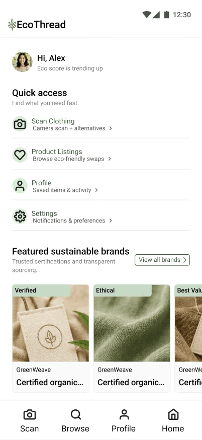
The core flow moves from onboarding to scanning, reviewing product details, saving items, and managing preferences. Early wireframes helped validate hierarchy and navigation before visual polish.


08
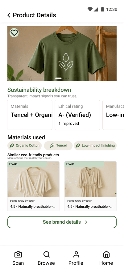
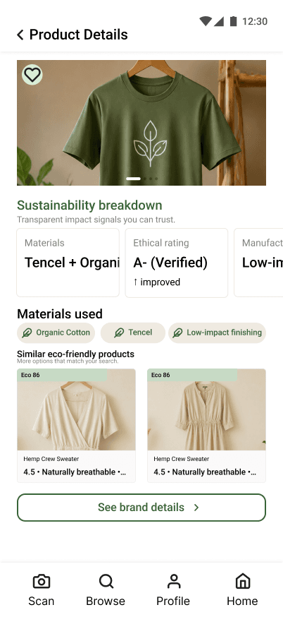
FINAL INTERFACE
A focused mobile system with clear visual hierarchy.


09
USABILITY TESTING
Testing revealed what the design alone could not.
Three participants completed key tasks and provided SEQ, SUS, and follow-up feedback. Their behavior exposed issues that were not obvious during the design process.
Scanner visibility
The scan action needed stronger prominence and clearer selected states.
Information hierarchy
Material, score, and verification details needed clearer grouping and emphasis.
100%
Task completion after revisions
6.3 / 7
Improved
Navigation and accessibility
Average ease rating
10
KEY IMPROVEMENTS
Before feedback. After feedback.
Scanner
BEFORE
Low visibility and unclear action states.
AFTER
Product details
BEFORE
Important sustainability information competed for attention.
AFTER
Dark mode
BEFORE
Some text and controls lacked sufficient contrast.
AFTER
11
REFLECTION
What I learned.
The biggest lesson was that features that felt obvious to me were not always obvious to users. Testing changed the way I evaluated the interface and showed how small accessibility and hierarchy improvements could have a major effect on usability.
© 2026 Maurice Reid
Have a project or opportunity in mind?
I’m currently looking for UX/UI and product design opportunities where I can contribute, learn, and help create meaningful digital experiences.
EMAIL ME →
LET’S CONNECT


RESEARCH
DESIGN
TEST
ITERATE
05
“The experience should make sustainable shopping feel simpler—not like additional homework.”

Improve
Refine navigation, hierarchy, accessibility, and feedback.

What I do
User research, user flows, wireframes, prototypes, interface design, usability testing, and design systems.
How I work
I start by understanding the problem, test ideas early, and use feedback to guide meaningful improvements.
Problem
Shoppers often want to make more sustainable choices but lack clear, trustworthy product information at the moment of purchase.
Goal
Create an intuitive scanning experience that presents verified material and sustainability information without overwhelming the user.
Speed
The scanning flow needed to feel immediate, familiar, and easy to recover from.

Dark mode contrast
Text and controls needed stronger contrast to remain readable and accessible.
Larger scan focus, clearer selected state, and stronger feedback.
Clear sections, spacing, and stronger hierarchy.
Improved contrast and more consistent surface colors.
Challenges
Balancing visual aesthetics with usability and simplifying complex sustainability information.
Next steps
API integration, a larger testing pool, personalized recommendations, advanced filtering, and deeper analytics.
FEATURED CASE STUDY
EcoThread
Making sustainable fashion information easier to understand.
A mobile experience that helps shoppers scan clothing, view clear sustainability details, and make more informed purchasing decisions.
ROLE UX/UI Designer
TOOLS Figma · Figjam · Stark
FOCUS Research · Prototyping · Testing